What Is High CTR Visual Ads and Why It Matters
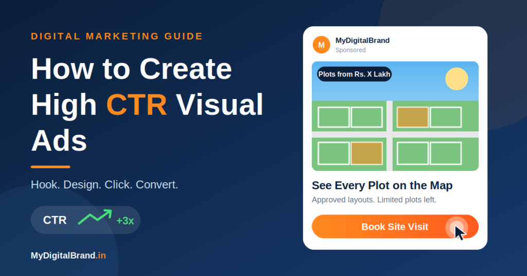
Click-through rate (CTR) is the percentage of people who click your ad after seeing it.
CTR = (Clicks ÷ Impressions) × 100
A higher CTR usually means a more relevant ad, lower cost per click and better delivery from the ad platform. The visual is the biggest factor, because people decide in under two seconds whether to stop scrolling.
Step 1: Start with One Goal and One Audience
Every high-CTR ad is built for one person and one action.
- Goal: leads, site visits, calls, WhatsApp chats or sales
- Audience: for example, “plot buyers in Tamil Nadu, 28-45”
- Offer: what they get by clicking, such as a free site visit, price list or demo
If you cannot state the goal, audience and offer in one sentence, the creative will be unfocused.
Step 2: Create a Hook for the First Two Seconds
To create a High CTR Visual Ads, Hook plays important role. The hook is the part that stops the scroll. Effective hook types:
| Hook type | Example (real estate) |
|---|---|
| Question | “Looking for a DTCP-approved plot near Chennai?” |
| Bold number | “Plots starting at ₹X lakh” |
| Problem | “Tired of unclear plot boundaries?” |
| Before/after | Empty land → aerial layout view |
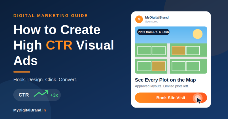
| Curiosity | “See every plot on the map in 10 seconds” |
Put the hook at the top or center of the image, or in the first frame of a video.
Step 3: Design a Clear Visual Hierarchy
The eye should move in this order: image → headline → offer → button.
- One main focal point, not five
- Large headline, readable on a phone at arm’s length
- Limit text to what is necessary (aim for under 20 words on the image)
- Leave white space so the key message stands out
- Keep important content away from the edges, since platforms crop and overlay UI there
Step 4: Use Color and Contrast Smartly for High CTR Visual Ads
- Contrast beats beauty. Dark text on a light background, or the reverse, always.
- Use one bright accent color for the button or key offer.
- Stay within 2-3 brand colors for consistency.
- Avoid colors that blend into the platform (plain white and blue feeds).
- Test warm colors such as orange, yellow and red for attention.
Step 5: Choose Strong Images
- Use real, high-resolution photos, not generic stock
- Show people, faces or real places when possible
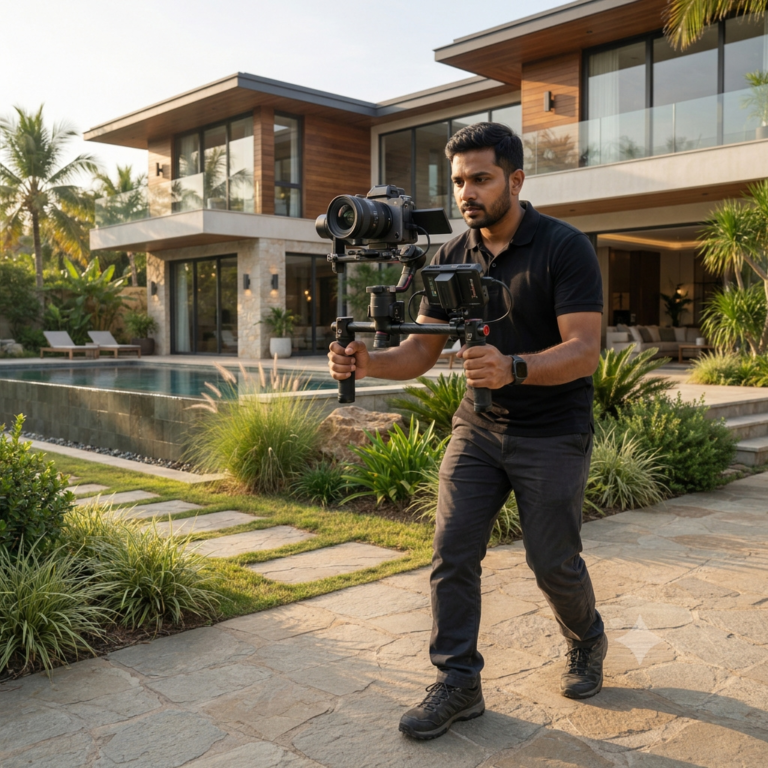
- For plots and properties, aerial drone shots and clear layout views perform well
- Show the product in use or the result, not just a logo
- Keep one subject per image
Interactive demos can make strong creatives too. A short screen recording of the Google Maps plot overlay showing a plot being clicked and its details appearing is a clear, curiosity-driven visual for real estate audiences.
Step 6: Write Short, Benefit-Led Copy
Headline formula: Benefit + Specific detail
- “Own a Plot Near Cheyyar from ₹X Lakh”
- “Explore Every Plot in 360°”
Body copy: one or two lines on the offer, a trust point (approval, RERA, years of experience) and urgency if genuine (“Limited plots left”).
Avoid long paragraphs, jargon and vague claims such as “best quality.”
Step 7: Make the Call to Action Obvious
- Use action words: Book Site Visit, Get Price List, View Plots, Chat on WhatsApp
- Make the button high-contrast and large enough to tap
- Match the platform CTA button to the creative’s message
- Use one CTA only
Step 8: Pick the Right Format and Size for High CTR Visual Ads
| Placement | Recommended ratio |
|---|---|
| Feed (Facebook/Instagram) | 1:1 or 4:5 |
| Stories and Reels | 9:16 |
| Carousel | 1:1 |
| Google Display | Responsive, multiple sizes |
| YouTube | 16:9 (shorts 9:16) |
Check each platform’s current specs in the Meta Ads Guide before exporting.
Video tips: hook in the first 3 seconds, add captions (most people watch muted), keep it under 15-30 seconds, and end on the CTA.
Step 9: Match the Ad to the Landing Page
A high CTR with no conversions wastes money. Make sure the landing page:
- Repeats the same offer, image style and headline
- Loads in under 3 seconds on mobile
- Has a short form or direct WhatsApp/call button
- Shows trust signals such as reviews, approvals and photos
Step 10: Test, Measure and Improve to create High CTR Visual Ads
Test one variable at a time:
- Image or video (drone view vs. layout map vs. people)
- Headline (price-led vs. benefit-led)
- CTA (Book Site Visit vs. Get Price List)
- Format (static vs. carousel vs. short video)
Run each test for 3-7 days with enough budget to collect data. Track CTR, cost per click, cost per lead and lead quality. A high CTR alone is not success; the goal is qualified leads at a good cost.
Free design tools such as Canva make it easy to produce several variations quickly.
Common Mistakes That Lower CTR
- Too much text on the image
- Low-resolution or stretched photos
- Weak or missing CTA
- Many colors and fonts in one design
- Same creative shown to the same audience for weeks (ad fatigue)
- Clickbait that the landing page does not deliver
Quick Checklist Before You Publish
- One clear goal, audience and offer
- Hook visible in the first 2 seconds
- Headline readable on mobile
- High-contrast colors and button
- Single, specific CTA
- Correct size for each placement
- Landing page matches the ad
- At least 2-3 variations ready to test
Conclusion
High-CTR visual ads come from clarity, not complexity: a strong hook, a single message, high contrast, honest benefit-led copy and a clear CTA, followed by steady testing. Apply this to every creative, and refresh it regularly to avoid fatigue.
Want ad creatives and campaigns with High CTR Visual Ads? Contact MyDigitalBrand for ad design, drone visuals and interactive property tools.